E-mail Design
The following e-mail won two awards:
Capital One: MarketingSherpa Gold Consumer Award for Best or Most Dramatic Best Test and 12 Creative Best Practices
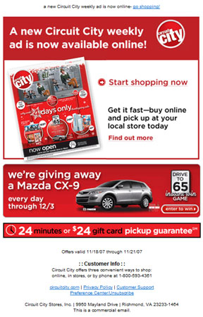
"Going where more of us should go more often, the team at Capitol One decided to test how well their e-mails work when they aren't working – when the graphics don't display. By running a combination of graphic and html text in various creative iterations, they hit on just the right mix of the two that resulted in a dramatic overall increase in response."
"Partnering with representatives from the lines of business, the project team designed a testing agenda to analyze usability, viewability, content personalization and trust factors associated with e-mail marketing. The results were then translated into a list of 12 creative best practices that are now incorporated into every e-mail campaign…Following all 12 best practices resulted in a 79% lift in net response rates."
Capital One: MarketingSherpa Gold Consumer Award for Triggered Email: Converting Customers to Online Servicing
"In this campaign, Capitol One recognized a win/win situation: they saved themselves money by moving frequent callers to the Internet, where these frequent balance checkers could more easily keep track of their money. They did this by analyzing their phone log records and e-mailing relevant messages to the list of individuals with high call frequency with messages around how much easier keeping track of their balances is online. Their customer was happier while the bottom line improved, meaning a marketer did their job well."
"Call volume for these customers dropped by 33%, resulting in cost savings for Capital One."
— MarketingSherpa
Capital One: MasterCard's Sugarland Promo
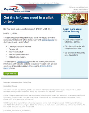
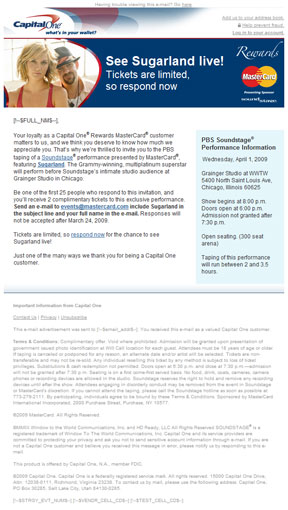
At Capital One, the company created customizable variable tags that auto-populated data. Usually it was the name of the recipient, an interest rate, or the last four digits of an account, this created a more nimble, customized experience based on subscriber's interactions with their accounts.
Capital One: Auto Finance
Circuit City: MarketingSherpa Gold Consumer Award for Best Opt-In E-mail
"This is the first holiday themed campaign for Circuit City and campaign outperformed all previous holiday campaigns. Sorry, the judges promised this winner that we would keep their results private. However, be assured that we have seen all the data and were thoroughly impressed!”
— MarketingSherpa
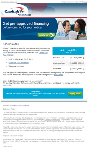
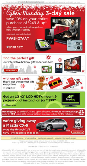
Below is an example of an e-mail layout we tested using graphics and css. Our biggest open and conversion rate success was when we placed our headline promo text on the left side and graphics on the right. We used descriptive alt tags on graphics including our call-to-action buttons. We gleaned our user's online purchasing habits to personalize product selections which resulted in increased sales by 25% for an 11 million strong subscriber's list.
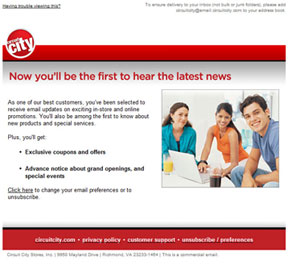
Circuit City Welcome E-mail
Redesigned from successful tests where HTML text was (replacing graphics only text) laid out on the left side and image graphics on the right. We also began to include an option to unsubscribe from our e-mails. When users subscribed to Circuit City's e-mails, this was the introductory email that set expectations of what subscribers would be receiving in their inboxes in the future.
Circuit City Weekly Ad
This e-mail was an all graphics test where the headline promo image was placed on the left and text to the right. The subordinate promo for Mazda was the opposite. Circuit City's Weekly Print Ad at that time, was loaded as a graphic on their website as they began to phase out the print version.
