UI/UX Design
How can I make something easier to use? Starting out as an user like everyone else, I found myself frustrated using websites with numerous links trying to reach information I needed. There were many times I never found what I needed or I stopped looking and left the web site...that's when my "fix it" gene kicked in. I had been a very successful Email Specialist that wanted to understand the What, How, and Why? that makes websites and apps useable and successful.
AccessVA Project
Client: U.S. Department of Veterans Affairs
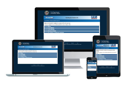
The AccessVA project had many sub-projects that were designed to help Veterans, families of Veterans, active Service members, and business partners to register their IDs as credentials so they could access the numerous government services and benefits. The project's audience was for three generations that used cellphones, tablets, laptops, and desktop computers. This required the creation of a Style Guide that was 508 compliant and creating break points for popular mobile devices for the Department of Veterans Affairs.
AccessVA Wireframe
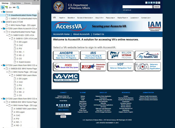
The AccessVA wireframe demonstrates step by step (hierarchy) the process of users logging into the applications supported by the VA. On the left side Sitemap, under the General folder, the Unauthenticated page is where Veterans visit before logging in. (You can select each page icon in the Sitemap to navigate.) Each folder contains a method of registration, redirects, verifications, notices while processing requests, and success/error messages.
Note: The wireframe itself is not designed to be viewed on a mobile device, but to view on desktop browsers which is a commonly used method to demonstrate prototypes for the federal government.
The footer was reduced to three main categories with no subcategory links in a later iteration.
I am working to obtain permission from the government to display the user workflows, but up to this point, remain unavailable.

